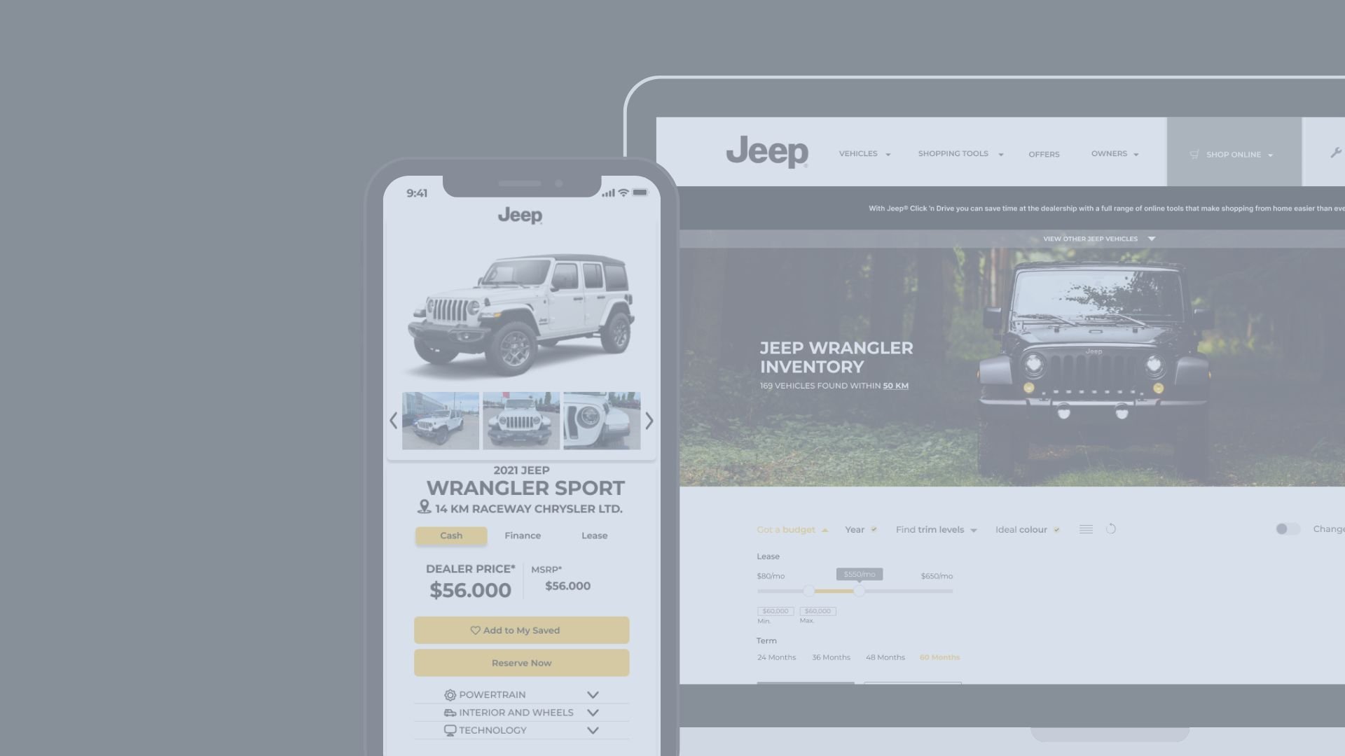
Jeep SNI Tool
Working in Miami AD School UX Design Bootcamp,
I spent summer 2021 working on improving
the Search New Inventory (SNI) tool for Jeep.ca.
Role & Team
Teamed up with 2 team members, I worked as a UX designer for the new SNI tool for the Jeep Canadian website.
Duration
2 months (Jun. 2021 - Aug. 2021)
Overview
With 2 team members, I was tasked to improve on the Jeep SNI tool to decrease the overall bounce rate and increase the sales conversion rate. This tool aimed to offer a seamless and intuitive vehicle purchasing journey that is linked to other parts of the website.
Tool
Figma, Miro, Adobe Illustrator
Scope
UI/UX, Wireframing, Competitive Analysis, Rapid Prototyping, User Testing, User Flow, Persona, Information Architecture

The Challenge
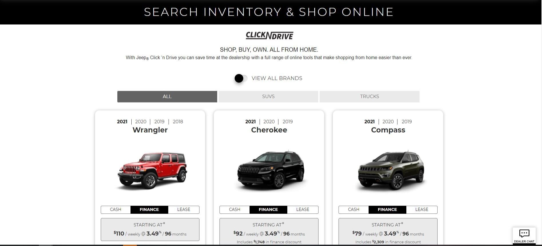
Jeep, a division of Stellantis, is known for its sport utility vehicles. Due to the COVID pandemics, it is currently seeking an all-in-one online vehicle buying platform to connect users to dealers virtually.
Jeep seeks to improve on the existing Search New Inventory (SNI) tool allowing users to browse or search for available new vehicle inventory that is currently on the dealership lots.
Integration of the new SNI tool to other web components forming a seamless online vehicle shopping experience
Assisting users through the entire purchasing journey in order to boost sale conversion rate and decrease the bounce rate
Objectives
-
Sales
Lead more customers to place their orders with dealers online
Increased number of customers contact the dealers
Increased number of total orders/total visits
-
Engagement
Engage the users to interact with the tool in their online shopping journey
Increased number of user interactions with the tool
Decreased overall bounce rate from the page
-
Holistic
Assist users through the entire online shopping platform to access all the vehicle information available
Increased customer satisfaction & enhanced self-service
Decreased number of navigation levels and redirections to dealers' websites
Research
User Insights
Analyzing pain points and frustrations during the online vehicle purchasing journey. We have interviewed with the current site designers, marketing directors and 5 of the users who have just purchased a vehicle through the Jeep website.
"I first came to the page on my phone but it is too crowded to view all the vehicles on my phone. I probably will come back again to the same car tomorrow using my PC."
87% Of car buyers say that a positive experience on a website is likely to influence their purchase.
More than half of site traffic comes from mobile devices, making up 58% of the total traffic
“Visuals appeal to me”
90% of the current site interactions are with the inventory listings gallery
“Shopping online for a vehicle...Nah”
Although there are a lot of people doing research online (74%), there are still a lot of people who feel the discomfort of shopping online.
“Price comes first”
When it comes to choosing a car dealer, 59% of buyers said price is the most important considerations.
Customer Purchasing Journey
-
Which car is best?
Considering several brands and models based on the brand images
-
Is it right for me?
Starting to weigh practical considerations. Starting to check off their important features
-
Can I afford it?
Narrowing down the options, cost consideration comes into play
-
Where should I buy it?
Exploring nearby dealerships, also considered local inventory, deals, and specials
-
Am I getting a deal?
Researched lease money factors, and crowdsourced actual prices paid for different brands and models
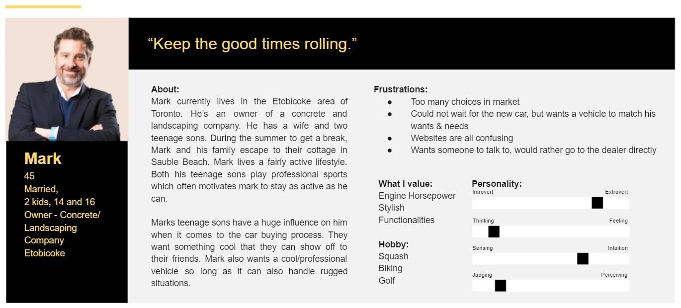
Personas
Envision
Ideal User Flow
Sketches
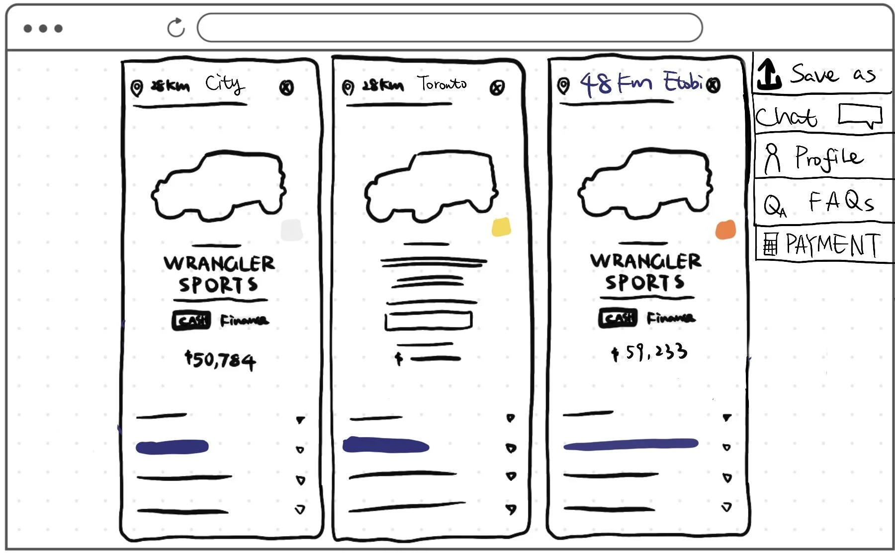
Desktop Comparison Tool
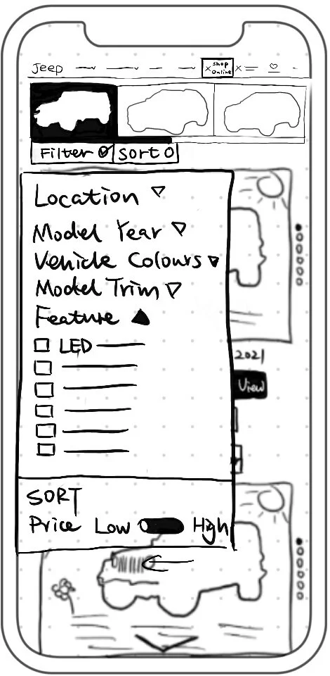
Mobile Filter Panel
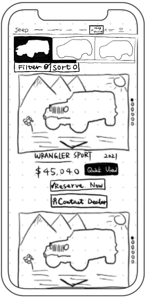
Mobile Vehicle List
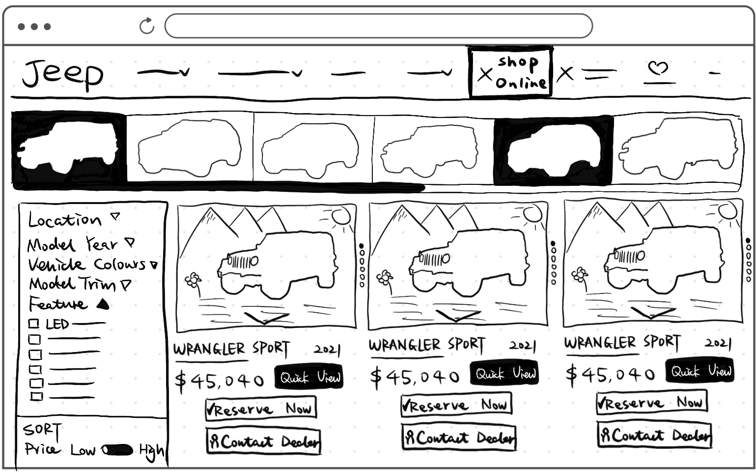
Desktop Vehicle List with Filter Panel

Solution 1.0
Alongside 2 web pages, 3 different tools are optimized to enhance the whole vehicle purchasing journey for the users.
-

Filter & Sort
Search Inventory Result Page
Filter & sort helps users to navigate through the Search inventory result page with fewer efforts. It is the first touchpoint when people are finding their ideal vehicle in the inventory.
-

Comparison Tool
Search Inventory Result Page
Comparison is used when users are comparing different vehicles to find the best fit. Users usually have a few options in mind during this stage.
-

Payment Calculator
Vehicle Details Page
When people are selecting between various payment options and terms, a payment calculator comes into sight.
Wireframe
Filter & Sort
Comparison Tool
Payment Calculator

Usability Test
Moderated Testing
Objectives
Understand the end-to-end journey of how users purchase a car
Assess awareness & discoverability of the tools(filter/sort, comparison & payment calculator)
Assess comprehension of content & tools
-
Screening
12 Participants
Age?
Occupation?
Geographic Location?
Already a car owner?
-
Task 1: First Time User
You have made up your mind to purchase a car, This is the first time you are on the Jeep SNI Tool website.
Your goal is to navigate through these interfaces and get familiar with what information and tools are provided.
-
Task 2: Come back to refine my list
After narrowing down to the 3-5 options last time, You are hoping to select the one you are most likely to buy.
Your goal is to navigate through these interfaces and finalize the 3-5 vehicle options you want to select from.
-
Task 3: I am deciding “the one”
You have "the one" in mind, what will you consider doing next? Is there any information you still want to know?
Your goal is to navigate through these interfaces to prepare to purchase the vehicle you have selected.
Testing Results
What People Are Saying
Photo Gallery
All of the participants tried to flip through the vehicle photo gallery.
All of the participants interacted with the tool to enlarge the vehicle pictures.
10 out of 12 participants mentioned the actual photos of the vehicle's interior and exterior would be helpful.
“Comparison/Calculator is not obvious”
8 out of 12 users reported that the compare and payment calculator tools are difficult to notice while feel they are helpful after being pointed out to them.
Filter & Sort
Half of the users interact heavily with the Filter & Sort tool
Unknown…
5 out of 12 users reported that they hesitate to click on any buttons if they are unclear about what they will be redirected to.
The signs are observed more when it comes to elderly audiences.

Final Mockup

Design Changes
-
Enlarge the picture gallery section on each page
Add in “Zoom in/out” function to allow users to see more details if needed
-
Allowing more space to be saved
-
By enlarging the text and icon sizes
-
Making essential information appear before the user clicks on to the buttons
Releasing some of the tools out of drop-down panels if necessary


